Friday, May 25, 2012

Deja Vu

Alright, let's take a look at some animated characters.


This is the Count of Monte Cristo.
He's from an anime that's either pretty strange or really tame depending on whether or not you like anime ( because if you do like anime, you understand just how much worse it could be...). Anyway yes, this anime is based on the book,
and the Count has a demon thing living inside him.
But enough about him.


This is Albert. He's really reeeeally normal. Rich, and born into an aristocratic family, but seriously, he's more than a little lame. Still, he's a good guy, as you can probably tell. You know, even if he didn't have angel wings for some reason. I don't know why those are there to be honest, so we'll ignore them. They'd make this too easy.


So, why is it so easy to tell which of these guys is a "good guy" and which is a "bad guy"? Color and lighting of course. First, let's look at the hues used on these two. First, if we look at The Count, he shows off a number of different, sharply contrasting hues. Red next to black next to blue, there's surely a lot going on inside his mind, maybe even something dangerous, but we don't know that yet. Additionally, there are no natural skin tones in The Count's image, which makes him seem otherworldly (which he is). Meanwhile, Albert is surrounded mostly by shades of blue, a calming color. The lack of diversity here gives away his simple, trusting personality.

Next, we'll take a look at brightness. Naturally, we correlate darkness with evil. Come to the DARK side, remember? That said, The count is dark. Very dark. I guess that means he is chaotically evil after all. Meanwhile, Albert's image is so bright, it practically has lens flare. Speaking of which...

Saturation! This time, there isn't much contrast between the characters. Because of the art style used throughout this anime, most colors are aggressively saturated. As for our pictures, the saturated colors serve to bring out the personalities of each character.

Okay. Time for lighting.

Due to the art style once again, we don't see many shadows in our images. The artists instead chose to emphasize the distinctive textures on nearly every surface in their "world". However, if you take a good look at The Count's eyes, you'll notice he has some nice shade under his eyebrows that Albert lacks. As a result, the Count appears more sinister in this image.

Now it's time to dig for some symbolism in the lighting. Well, you actually don't have to because I struck gold pretty quick. If we take the motif of light symbolizing goodness and truth, the characters' fashion sense suddenly foster some symbolic implications. The Count has long hair and a flowing cape, both of which are thrown behind him, blocking out the light source in his image. Meanwhile, Albert, with his normal clothes and short hair, is completely bathed in the light. As it happens, The Count is in fact a "bad guy" but this is in part because he blocks out the truth and goodness in his life. Meanwhile, Albert is all kinds of wide-eyed, idealistic faith.

To close things up, I suppose we should just look at the lighting in the above images and "feel". Where does the light go? Does it reach us? In my opinion, it seems that the light in Albert's image reaches out of the image toward us. On the other hand, The lighting in The Count's image dies in the distance, leaving us with a cold, stormy mood instead.

Anyway, that's enough of that feeling stuff. Don't want to grow angel non-canonical angel wings.

\m/

Okay, so this entry is meant to compare two songs that are... well, the description gets so general, I guess it's just to compare two songs. I was thinking of comparing some song I know of that are totally unrelated but have uncannily similar melodies, but the songs I'm thinking of are triplets, not twins. Still, I'm posting them. I just won't be analyzing them.

Observe:

Bon Jovi - You Give Love a Bad Name

Nightwish - Where were You Last Night

Sabaton - White Death

I really like all three songs, especially White Death, but it just bugs me how similar they are. I ran across a fourth one of these once, but I don't remember what it was.


Anyway, analysis. I've decided to compare two Nightwish songs. Yes, I like Nightwish a nice damn lot. The song above featured a different lead (female) singer from the singer in the two following songs. The two songs I'll be comparing are both from the most recent Nightwish album, Imaginaerum. I happen to have that particular CD right here, too. All the more reason to use these two songs:

Nightwish - Storytime

Nightwish - Ghost River

Here's what I came up with on my "Listening Framework" sheet:


Listening Framework
(SIMPLIFIED)

Listening Phase 1 (Rhythm)

Tempo [slow, medium, fast]

Allegretto

Source [where is the rhythm coming from?]

Background strings in early intro, then drums for most of song.


Groove [describe how the personality of the rhythm]

Dark, flowing, energetic

Listening Phase 2 (Arrangement)

Instrumentation [which instruments drive the song?]
Distorted electric guitar and lead vocals make up most of song, followed by backup vocals, piano, and strings. Finally, accents are made by bells (misc. percussion) timpani, and brass.

Structure/Organization [how is the song built? Order, patterns, etc.]

Intro, chorus, verse, chorus, instrumental section, chorus, stronger chorus.


Emotional Architecture [Draw how the song build and drop?]


______
__ ///---------____----------//\\ ___-------//
--^--^--/// \\---// \\___---////

Listening Phase 3 (Sound Quality)

Balance

  • Height [high and low of frequency]

Lots. Low pitch brass, timpani; mid pitch guitar, strings; High pitch vocals, guitar, bells

  • Width [stereo panning left/right]
    Not much panning, vocals and lead guitar are front and center, backing vocals/orchestra kept to either side, to the back.

  • Depth [layers of instruments - via loudness]
    A lot of depth, features an orchestra/choir
Listening Framework
(SIMPLIFIED)

Listening Phase 1 (Rhythm)

Tempo [slow, medium, fast]

allegretto

Source [where is the rhythm coming from?]

Drums, brass when drums are not present.

Groove [describe how the personality of the rhythm]

Poppy sometimes, heavy and violent others.

Listening Phase 2 (Arrangement)

Instrumentation [which instruments drive the song?]

Lead vocals (male and female), electric guitars consistently lead, sometimes give up lead to trumpets/brass. Strings are consistently backing. Children's choir takes over once, backs other times. Least common is occasional percussion.

Structure/Organization [how is the song built? Order, patterns, etc.]

Short intro, chorus, verse, chorus, instrumental, chorus, choir chorus (it makes sense), instrumental, chorus.


Emotional Architecture [Draw how the song build and drop?]


___ ----
____ -^--^--^--------__ -^--^--^------- \/ -------- ----
-^-^--^-^-/ \______/ \\_____/ \--/\__/

Listening Phase 3 (Sound Quality)

Balance

  • Height [high and low of frequency]
Not very high, low and medium frequencies from guitars, male vocals, occasional high from female vocals


  • Width [stereo panning left/right]
Not really panning. Orchestra in back, guitars and lead vocals in front.


  • Depth [layers of instruments - via loudness]
      1. A lot of depth, blasting vocals, guitar, and brass interrupting quieter parts.

As I feared, my emotional architecture didn't really make it. Still, you can see the general shape of each. They're both sort of similar in that sense. However, Ghost River has a number of emotional spikes where it suddenly brings in a bit of loud guitar or particularly nasty male vocals. After mapping the emotional architecture for both of these songs, I find the concept of graphing pure emotion as I did just now leaves a lot of information out of the emotional analysis. Especially in the case of these two songs, the raw emotion of the two songs resemble each other despite inspiring drastically different emotions.

The Rhythm and instrumentation of Storytime is very similar to that of Ghost River, which is the primary reason for the similar curves, but when I hear Storytime, I just get... happy! The images invoked by the lyrics, mixed with the fantastic, even optimistic melodies make for a very different experience from the aggressive vocals and dark lyrics you get from Ghost River.

The energy behind Ghost River is one of the main reasons metal is by far my favorite genre of music, but it doesn't “feel” anything like Storytime. To make a more meaningful emotional model of a song, I think it makes sense to graph the change of each separate emotion over the duration of the song (although I'm not going to do that).


Looking back at some more of the similarities between the two, I notice that both songs follow a sort of commercial pattern. Chorus, verse, chorus, verse, chorus, etc. This actually made me sort of sad to think about, but then I realized that the consistent pattern to both songs didn't take away from what I really like about Nightwish. What I love to hear in both Storytime and Ghost River is the mix of poppy female vocals, growling male vocals, choruses, electric rock guitars, and an entire orchestra.

When all of those diverse elements can converge into this type of music, it makes me feel like I'm listening to something truly epic that other artists can't offer. I mentioned earlier that metal is my favorite genre, but to get more specific, my absolute favorite genre of music is symphonic metal, and that's exactly what you get, in two different emotional flavors from Storytime and Ghost River.


-PARP-

So I have to transcribe a scene and talk about sound.


I chose this scene.

I was unable to post the .pdf like we were supposed to, so here it is in normal text form:


FADE IN
EXT. AN OCEAN BEACH ADJACENT TO WOODS - DAY
Pilgrim, a burly guy wearing beach clothes and a FRIZBEE BAG and COLLEEN, a "hot chick", run along the beach and encounter a DOUCHE with a SUBMACHINE GUN. Waves crash -WOOSH-.
DOUCHE
Hey Colleen, who's that turkey with you?
COLLEEN
He's just a thrower.
DOUCHE
Sorry buster, you ain't allowed here. Take off.
PILGRIM
Hey, lighten up. We're just throwing.
DOUCHE
Oh yeah? Let's see ya throw one.
Pilgrim hefts a FRIZBEE, then throws it. The Douche catches it -THWAP-, then tosses the FRIZBEE under his leg and back to Pilgrim. The Douche stomps around, then catches the FRIZBEE again. Then he tosses it under his leg and passes it back again. Pilgrim catches it -THWAP-. Then, the Douche walks over to a towel to put his SUBMACHINE GUN down. Pilgrim puts his hand on Colleen's arm.
HERO
(to Colleen, commanding)
How 'bout you get lost.
COLLEEN
What do you mean?
Pilgrim discreetly pulls razor blades from the FRIZBEE BAG.
PILGRIM
I mean it. Move out. Now!
Pilgrim pushes Colleen away and throws the FRIZBEE toward the ocean -WOOSH-. Colleen chases the FRIZBEE.
PILGRIM
Hey Colleen!
Colleen stops and turns halfway around.
PILGRIM (CONT.)
You got a great ass.
COLLEEN
Thanks, so do you, Pilgrim.
Colleen continues to run away. -WOOSH- The Douche turns back to Pilgrim. Pilgrim pulls out a FAST FRIZBEE.
PILGRIM
You don't look so hot to me.
Pilgrim throws the FAST FRIZBEE. The Douche catches it -SNAP-.
DOUCHE
Oh yeah? See if you can catch this.
The Douche throws the NEW FRIZBEE back to Pilgrim. Pilgrim catches it -WHUMP-. Pilgrim puts the FAST FRIZBEE away and pulls out a RAZOR FRIZBEE.
DOUCHE
Hey.
The douche beckons to Pilgrim.
DOUCHE (CONT.)
Now let's have it.
Pilgrim carefully hefts the RAZOR FRIZBEE and gets in a ready stance.
PILGRIM
(aside.)
For the Molochai Cops.
Pilgrim starts throwing in slow motion. Dramatic music begins. The RAZOR FRIZBEE flies slowly toward the Douche. It continues flying as the music creshendos -WOOOOOSSHHH-. The Douche puts up his hand, and the RAZOR FRIZBEE cuts through his fingers and strikes his neck -KA-KA-KOOMM-. The Douche sinks to the ground. Pilgrim fist pumps. The douche writhes on the sand and dies.
FADE OUT


Anyway, now to talk about some sound. Specifically, listening modes. In this scene, you can hear ocean waves quite frequently. This is causal sound. Simple as that. You hear waves because there are waves in the scene.

Apart from that, we hear some referential sounds right as the scene really starts to get "intense" what I'm talking about of course, is the synthesized -WOOOOOOSSHHH- noise that accompanies the thrown frizbee when it's flying in slow motion. I can't imagine that the sound itself is particularly deep in meaning, but it does serve a purpose. There are no natural sounds for a slow motion even because, as it happens, slo-mo isn't something that really occurs in nature. The stretched out, distinct noise that is used represents the slo-mo frizbee does its job where no causal sound would sync up.

Now, we'll move on to analyzing some time, but we're gonna stick with that slo-mo frizbee for a second. Influencing subjective time through sound is an important part of film making. certain moments will seem to take longer or fly by depending on the type of sound used. In the case of that slo-mo frizbee throw, the "wooshing" sound effect was drawn out, but so was the music that played in the background. Then when the murder frizbee hits its mark, the music adds in some harsh notes, and a metallic -KA-KA-KOOM- cuts off the "wooshing" effect. The audience's perception of time is slightly altered when this happens. time seems to stretch out and slow down during the throw, and then we get shocked back to real time with the crashing sound effect and the more energetic background music.

Wow, I wrote a lot for that. Keeping this short. Speed and loudness. Douche always catches with a harsh, quick -THWAP-. Represents cockiness. Pilgrim, (the hero guy) catches with two hands and a soft -WHUMP-. Represents control and coolness.

Alright. How 'bout you get lost.

Friday, May 18, 2012

Friday, April 27, 2012

iPhoto edits

Some photo edits I made (against my will) with iPhoto:


I think it looks like some kind of tendril-covered outcropping in some kind of dark world:


Cropped
Rotated
Color boosted
Edge blur
Increased saturation


My goal with this one was to make it look like there's a fire in the forest:


Cropped
Increased contrast
Increased temperature
Decreased tint
Enhanced


This one is a man falling from the sky:


Cropped
Straightened
Slightly De-noized 
Slight color boost

Friday, April 20, 2012

The Legend of Zelda: Skyward Sword

Observe:


The Legend of Zelda: Skyward Sword is the most recent console game in the Zelda franchise. It features a story line that explains the origins of many long-running conventions in the Zelda universe. Interestingly, it has been called both the best Zelda game ever, and the worst Zelda game ever. In my opinion... well... they're both acceptable statements. Some aspects of Skyward Sword were absolutely fantastic, while others had me groaning and wanting to put the game down for good.

Anyway, let's take a look at some of its specific elements:

Skyward Sword's in-game visuals vary depending on the user. Players have the option of seeing the entire controller on screen with descriptions of what each button does at any given time, just a smaller button prompt and maybe a map, or almost no help messages. That said, Skyward Sword's visuals are not all about functionality. Skyward sword features visuals that fall in between those of previous games in the series, compromising between realistic and cell-shaded "cartoon" visuals. These visuals, while new to the series, have impressed most critics, rather than polarizing them like the "cartoon" visuals of the past.

Skyward Sword features a large variety of objectives from collecting life-increasing "pieces of heart" from treasure chests, to shoring up equipment in shops, but in the end, it's all in preparation to save Zelda, and the land of Hyrule. The pieces of heart I mentioned earlier, are just one of the collection quests that players can opt to pursue. Much of the time, players prefer to complete Zelda games 100% by collecting pieces of heart, bugs, glass jars, anything the game has to offer. While these goods are not necessary to save Zelda and Hyrule, some people set goals to complete them.

Skyward Sword has several instances of guided perception, some of which are constant, and others that are activity-dependent. For example, players are pointed to objects with sound effects and arrows, placed on screen. When a player locks on to an enemy, the camera fixes itself over the main character's shoulder, plays a sound effect, and changes the color of an arrow above the enemy's head to let the player know "You have locked on to this enemy".

In closing, I don't think I'll ever be able to say for sure how much I enjoyed Skyward Sword. The visuals are amazing, the game makes great use of guided perception, an there's plenty to do and to achieve, but some of the mechanics involved are almost unforgivably bad. If I want to look at my inventory every time I pick something up, I'll look at it my own damn self.

Sylph and Torrent

Alright, it's character creation time. I'm gonna put together a protagonist and an antagonist using only images that showcase their individual characteristics: Color, Light, and Shape.

To begin with, the hero in this context would tend to be surrounded by lighting such as this:


The reason I chose this image was that it features straight, intense rays of light firing from the source. These straight lines easily represent a character "on the straight and narrow", a "ray of light in the dark". You know that if I can make a description entirely in clichés, the significance of the light is pretty obvious. In essence, the intensity, direction, and ray-like quality of the light suggest a righteous, powerful, and solitary character.

As for color,

I'm going blue.


Especially in this image, blue represents a kind of calm and satisfaction. Blue can make a person feel that everything is right with the world. as it happens, peace throughout the world is a major goal for my protagonist. This particular shade of blue also appears to be a heavy, pure blue, suggesting that the protagonist has an idealistic nature.

Next, we've got shape.

At this point, you can probably guess what shape I'll choose. Yup. Circle.


How could you not choose a circle for a hero like my protagonist? Righteous, calm, all of the troubles and attacks that come his way just roll off, like water on a sphere. However, it's difficult to make a humanoid character look spherical without losing some of it's humanity. Therefore, I would focus the circular shaping of my protagonist around his head and eyes.


Now, let's talk antagonism.

The villain to match my hero would not feature much light at all.


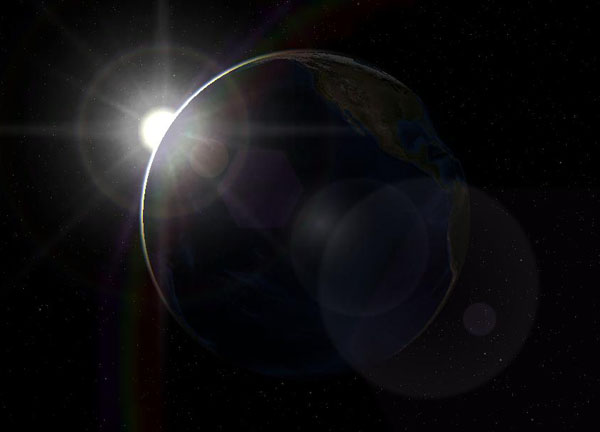
This picture doesn't feature light so much as it does shadow. In my mind, this villain would be seen facing away from the light, just as earth seems to look away from the sun. The light source would be distant and faint, suggesting the villain's distance and disdain for common values.

Back to color again.

Another easy choice. R-E-D.


In all honesty, red just contrasts blue too perfectly not to use. In its brighter shades, red suggests rage, intensity, and violence, nicely contrasting the protagonist's peaceful, balanced demeanor. Meanwhile, darker shades of red suggest lust and depravity, another strong contrast, this time against the hero's morality.

Finally, the villain's shape.

...Yes, well.
This shape isn't as clear as just a circle or triangle, and in fact incorporates both shapes. Rather than making this antagonist a perfect contrast, I chose to use hard angles mixed with curves to suggest that he was once round and pure like the protagonist. If you look at this shape, you'll see that it doesn't actually involve any whole triangles, but we mentally provide them. What this represents is the idea that there is more to the antagonist's character than what appears on the surface.

There you have it. Let the epic battle begin: Good vs Evil. Sylph vs. Torrent (those are their names)